ChatGPT ads are on their way: What it means for...
- News
- Paid Media

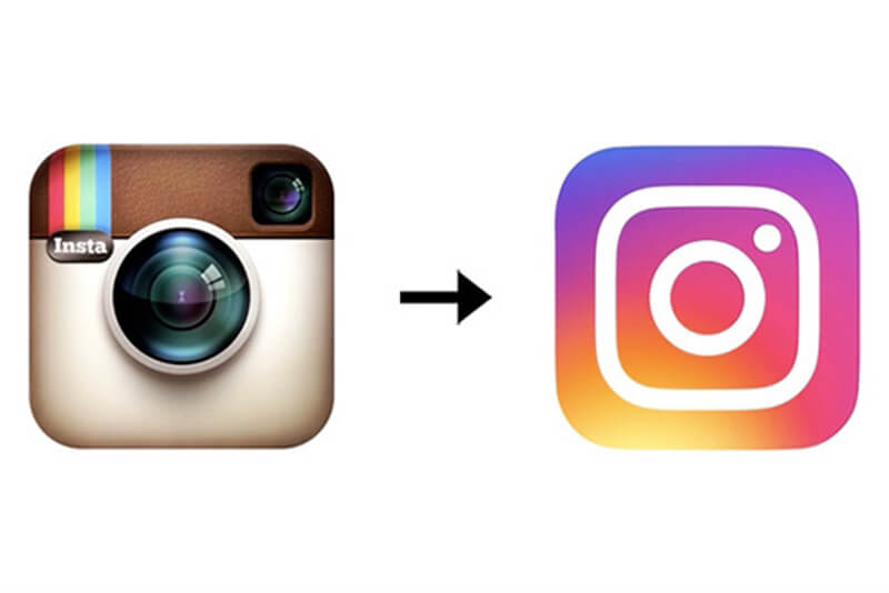
There has been a LOT of giggling on social media in last 24hrs, mainly because Instagram have released their new logo and nobody on the internet seems to be feeling it…
This tho. 😂 #instagramlogo #Instagram pic.twitter.com/q6k3ezNI3G
— Andrew Curry (@andrewcurryla) May 12, 2016
The new logo takes a much more minimal and simplistic approach to communicating the brand’s camera logo, placing a rainbow coloured gradient behind a sleek white camera design, released on Weds May 11th via the Instagram blog their team said;
“The Instagram community has evolved over the past five years from a place to share filtered photos to so much more — a global community of interests sharing more than 80 million photos and videos every day. Our updated look reflects how vibrant and diverse your storytelling has become…” Ummmm, okay?

Opinion in the LITTLE Agency office has been divided…
“I don’t mind it, but it reminds me of iTunes so much!” Grace, Content Team
“I like it and I understand why they’ve done it. I think it will sit much more comfortably alongside Facebook and Twitter as part of an icon set. I feel that the bold background colour choice is a brave attempt at being the most prominent app on any mobile device…” Ian, Production Director
“I’m not keen myself, I feel like it’s lazy, boring and looks like every other app logo. Boo!” Becca, Account Manager
“I like it, it reminds me of my childhood!” Jamie, Content Team
“I’m not a fan, I think the new logo cheapens the brand and has moved too far away from where they started. While I’m all for brands going through development, I think the new logo makes the brand look too ‘teenie bopper’ and doesn’t reflect the range of users or those who have been with the platform from it’s inception.” Fran, Content Team
What do you think? Love or loathe? Tweet us and let us know!