What law firms should trust AI with (and what they...
- News
- Opinion
- Search

2018 has officially arrived, kickstarting the design community back into action after the festive holidays, giving us all with 365 days to experiment, create and design the ‘new’ for everyone to see. But what have we learned from the past few years regarding trending design? What can we predict about the coming year and what can we expect to see? Well, the design team here at LITTLE have a few thoughts on what we believe will make it’s breakthrough this year and what will continue to dominate the design world…
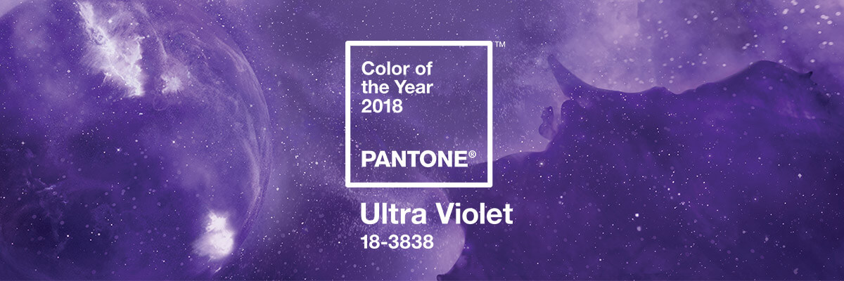
Towards the end of 2017 Pantone graced the world with its 2018 colour of the year, Ultra Violet (18-3838). A vibrant purple visualised by a cosmic backdrop, the colour has begun to spread across the community, producing bright, intuitive works of design, motion, product design, and art. Leatrice Eiseman, the Executive Director of the Pantone team describes it as: ‘From exploring new technologies and the greater galaxy, to artistic expression and spiritual reflection, intuitive Ultra Violet lights the way to what is yet to come.’ One of our favourite things about the ‘Colour of Year’ is seeing how creatives across the globe apply the colour in their fields and industries.
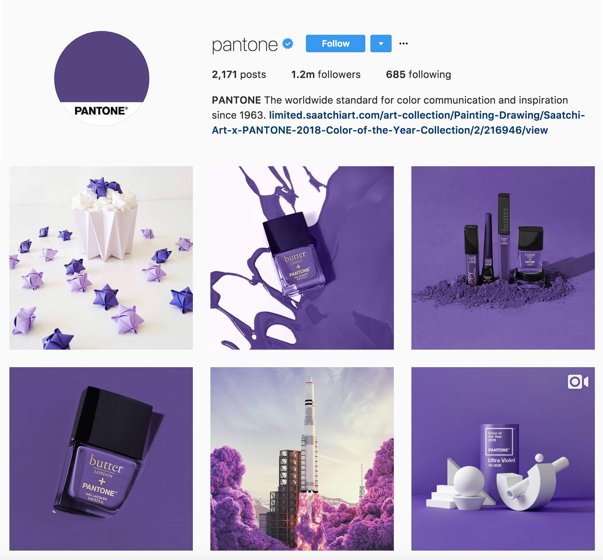
With the colour communicating originality, ingenuity, and visionary thinking that points us towards the future, we are sure to see a massive surge of 18-3838 in the coming year. Hopefully, we are part of that surge and have the opportunity to use it for a future project!
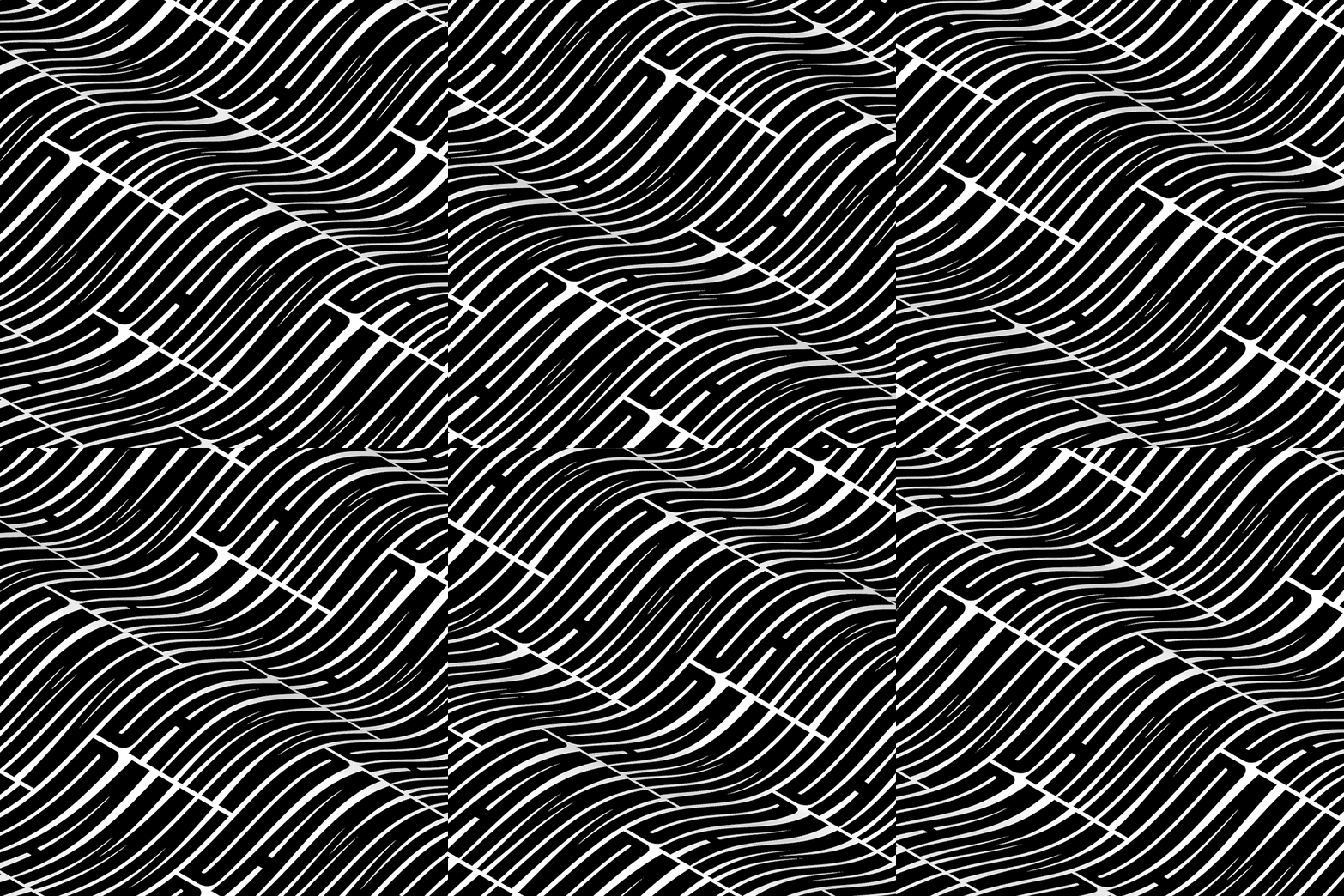
Something we seem to be running into now is the rise of experimental typography, and more interestingly it’s newfound relationship with Augmented Intelligence and Virtual Reality. We came across a few projects last year that really started to bend the boundaries of how far we can take the use of typography in branding and motion. Firstly we saw how Design Studio North applied a graduated font weight in the rebrand of The Science Museum during our trip to the Design Manchester festival in October. Something that not many of us had seen in use on such a mass market project, this surprised many with its striking rollout across the branded media and it’s animated logo. It’s an interesting take on experimenting with a range of font weights within the same logo and their relationship to each other when animated.

With experimental type on the rise, it’s starting to get really interesting when you look into how people are combining this with both motion and AR. Xavier Monney is one of the people at the forefront. Mixing mesmerizing animation with bold, impactful type, he began to make a name for himself last year when he posted a range of looped animations as featured on It’s Nice That, that you just can’t look away from. Since these posts he has started working with AR to produce animated tote bags and posters that literally jump out of the wall at you. The relationship between typography and AR is something that will continue to grow and rise with the popularity of devices such as the Oculus & Playstation VR; we can’t wait to see how it’s applied to both our devices and projects or briefs in the design world.
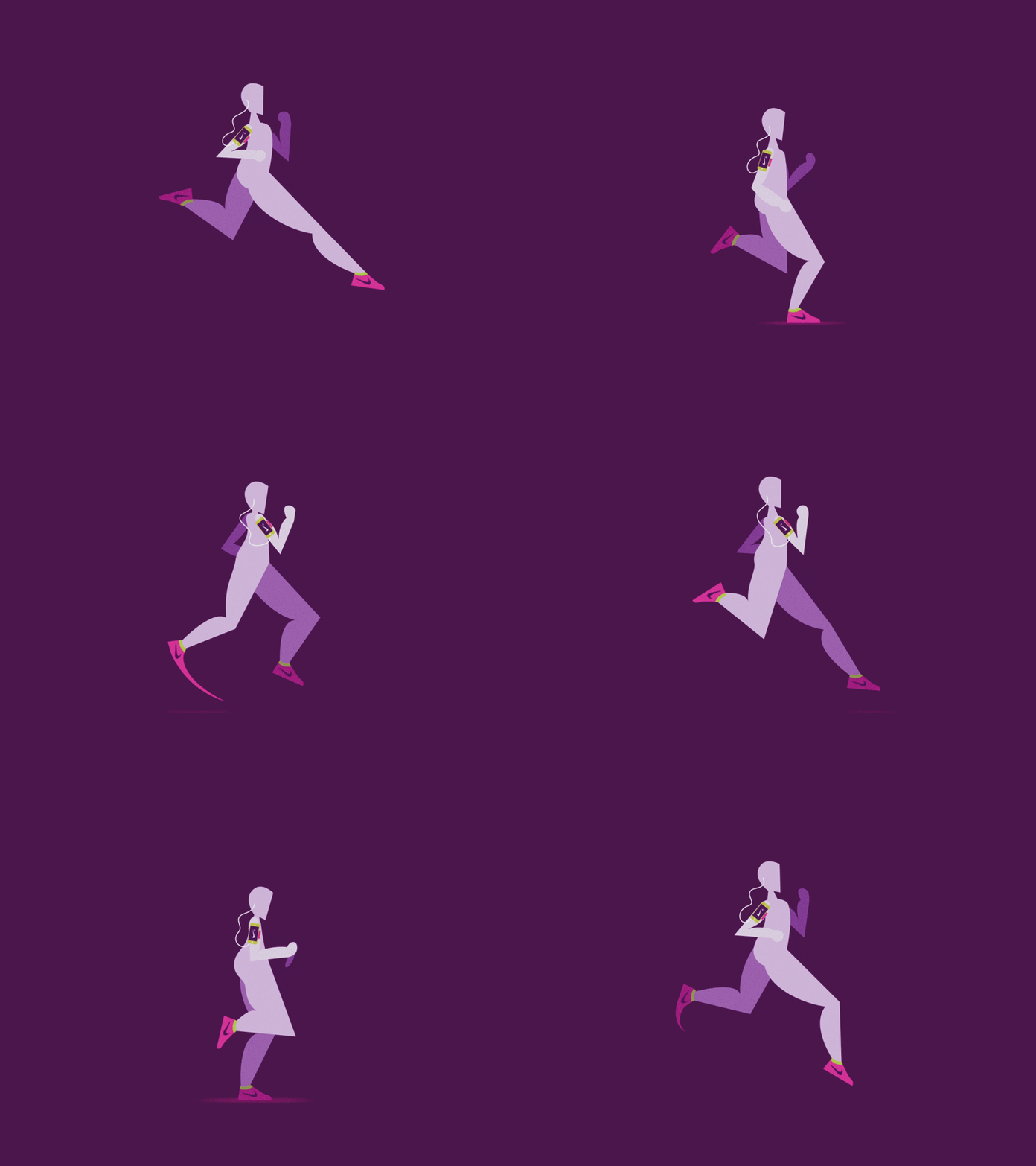
You only have to jump onto Facebook to see that every other post is either a video, an animation, a gif… or one of those memes you relate every aspect of your life to and tag your best friend in. Motion is and has been on the rise for the past few years with most modern day brands incorporating animated elements into their identity or social media one way or another. The ease of creating animated gifs in photoshop and learning the basics of After Effects has made creating motion graphics easier than ever, so we expect to see more motion coming from more brands on more platforms. If picking up a little motion skill in your life is one of your New Year’s Resolutions, then check out some of the following classes we have used to tighten up our motion skills: Character Walk Cycle – Intro Motion Graphics – After Effects for Beginners
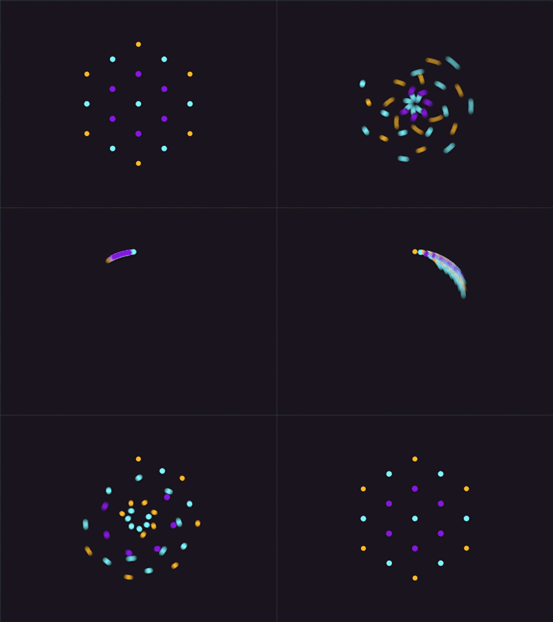
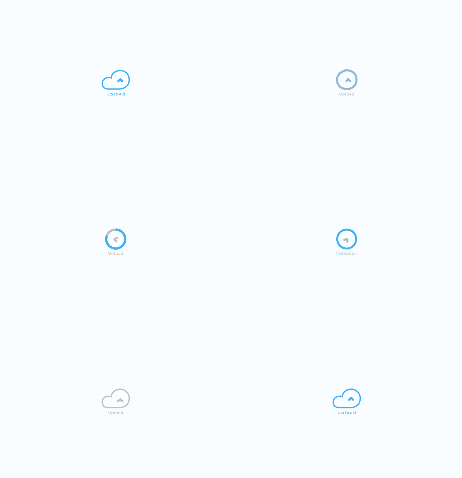
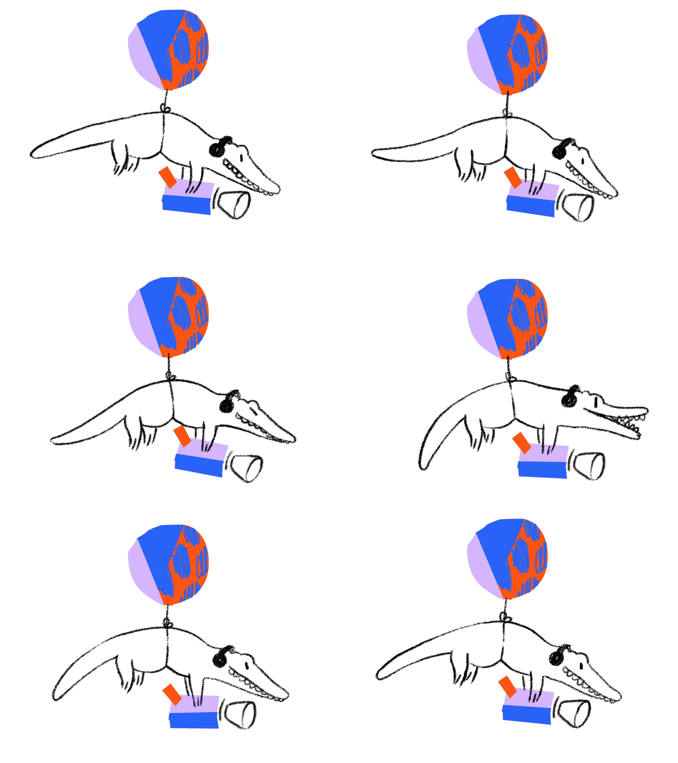
The need for motion within website design is also on the rise, with animated elements large and small popping up on some of our most regularly visited sites. These may be things you see every day but don’t necessarily realise have been created with you in mind, keeping your attention and easing your online process. Micro-Interactions come in so many possible forms, you may notice them in page loaders, and you may see them when your mouse hovers over a particular section of a website or button. Creating these and integrating them into both web and app design is now an essential factor and can be those last little details you need to complete a design. We expect to see even more websites utilizing these small animated elements as well as the boundaries for what can be achieved within web design stretched to their limit in 2018.
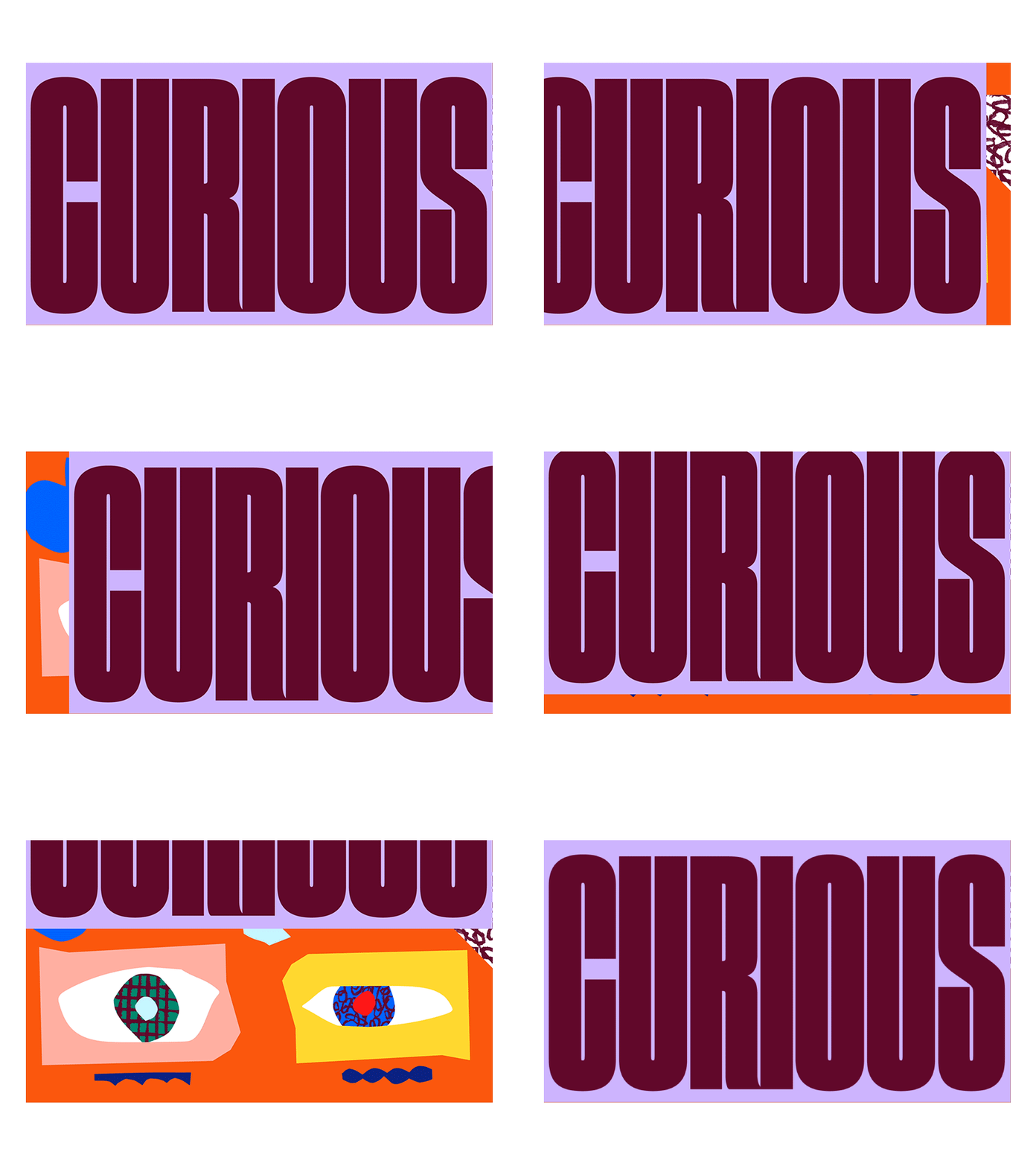
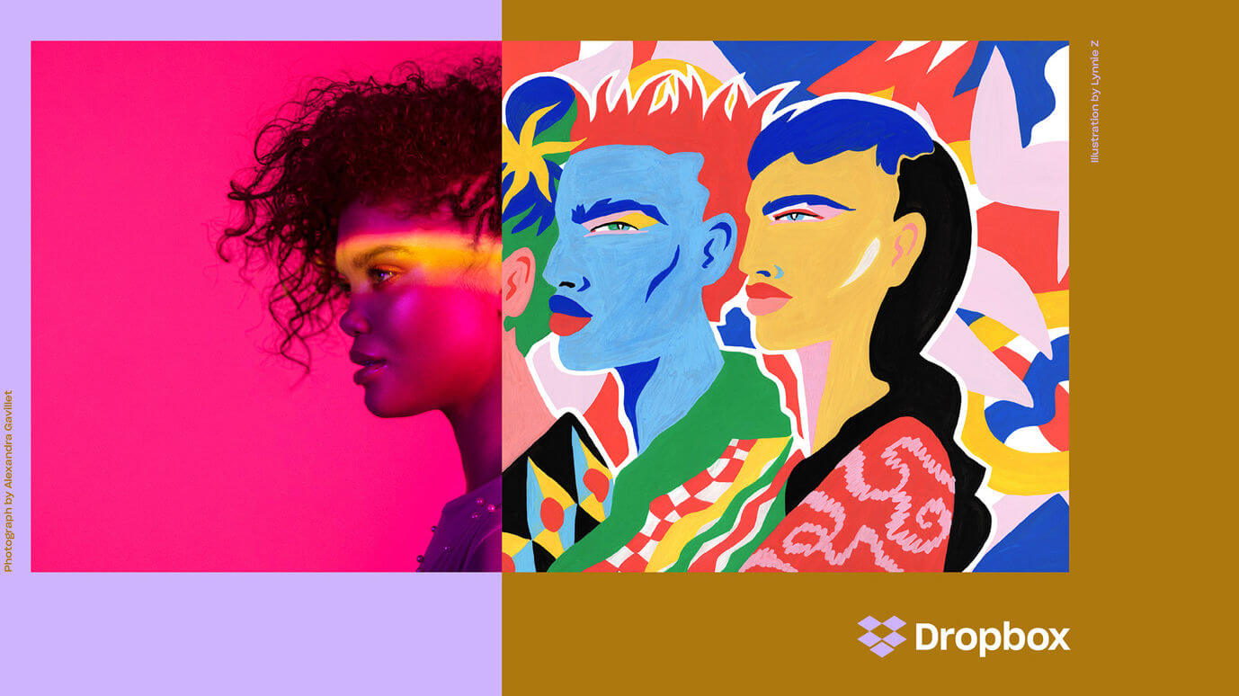
We all love trends, especially in the design community, some come and go like ‘glossy’ look website buttons and minimalist flat illustration… and some stay! Some of us may not like the subject of our next topic, but we can’t get enough of it, it’s bold, ordinarily unforgettable and can really make a mark if used correctly. We are talking about Wide Serif Fonts and Brutalist design of course! Dropbox Design hit us with a heavy dose of this towards the end of 2017 and nobody has forgotten about it. Combining wide fonts, colours you normally avoid and photography mixed with many different illustrations styles, Dropbox showed the world it sees itself as so much more than just a file storage and sharing system. This seemed to open the floodgates for a whole new era of wide, full-screen typography and Brutalist Design…
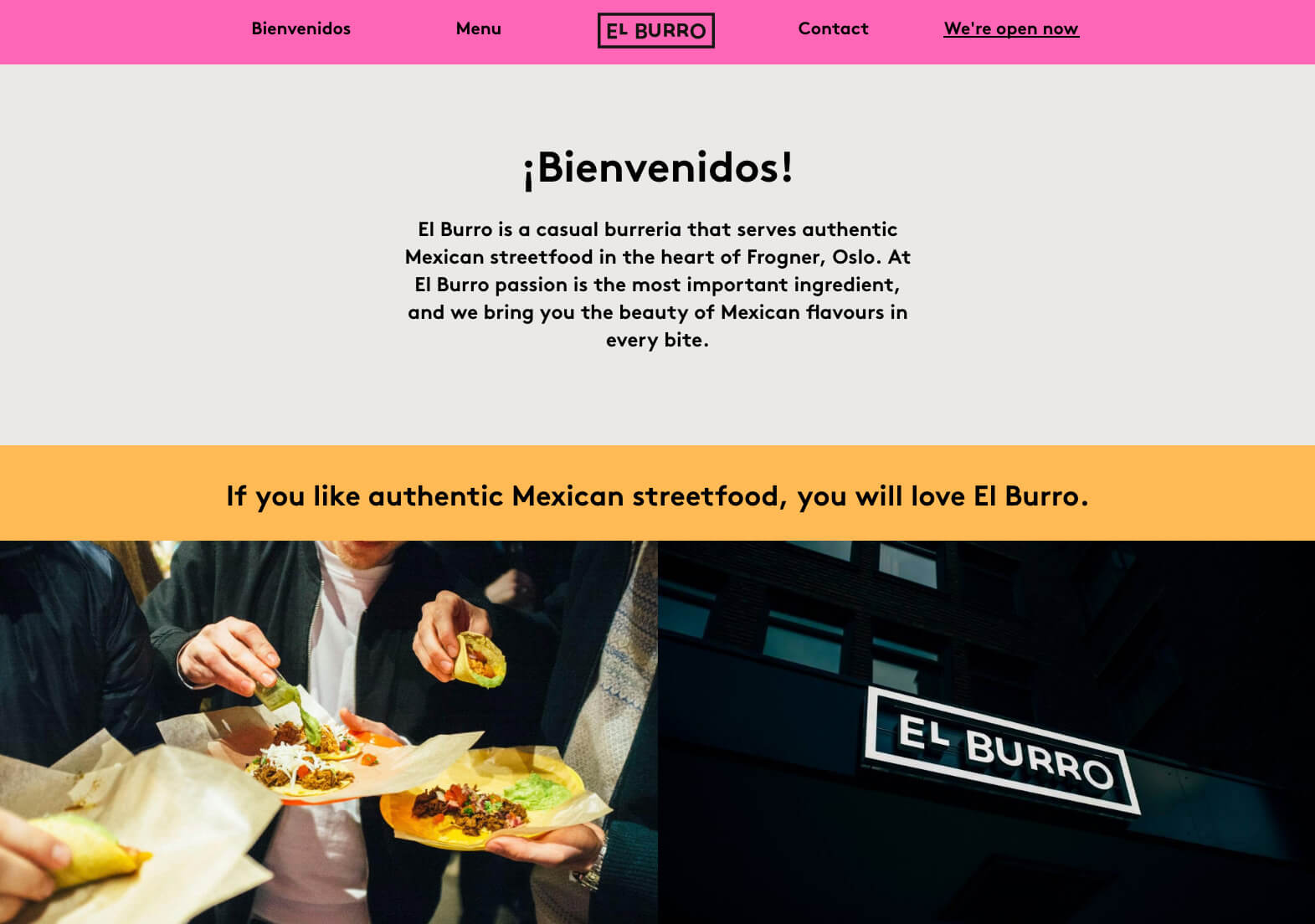
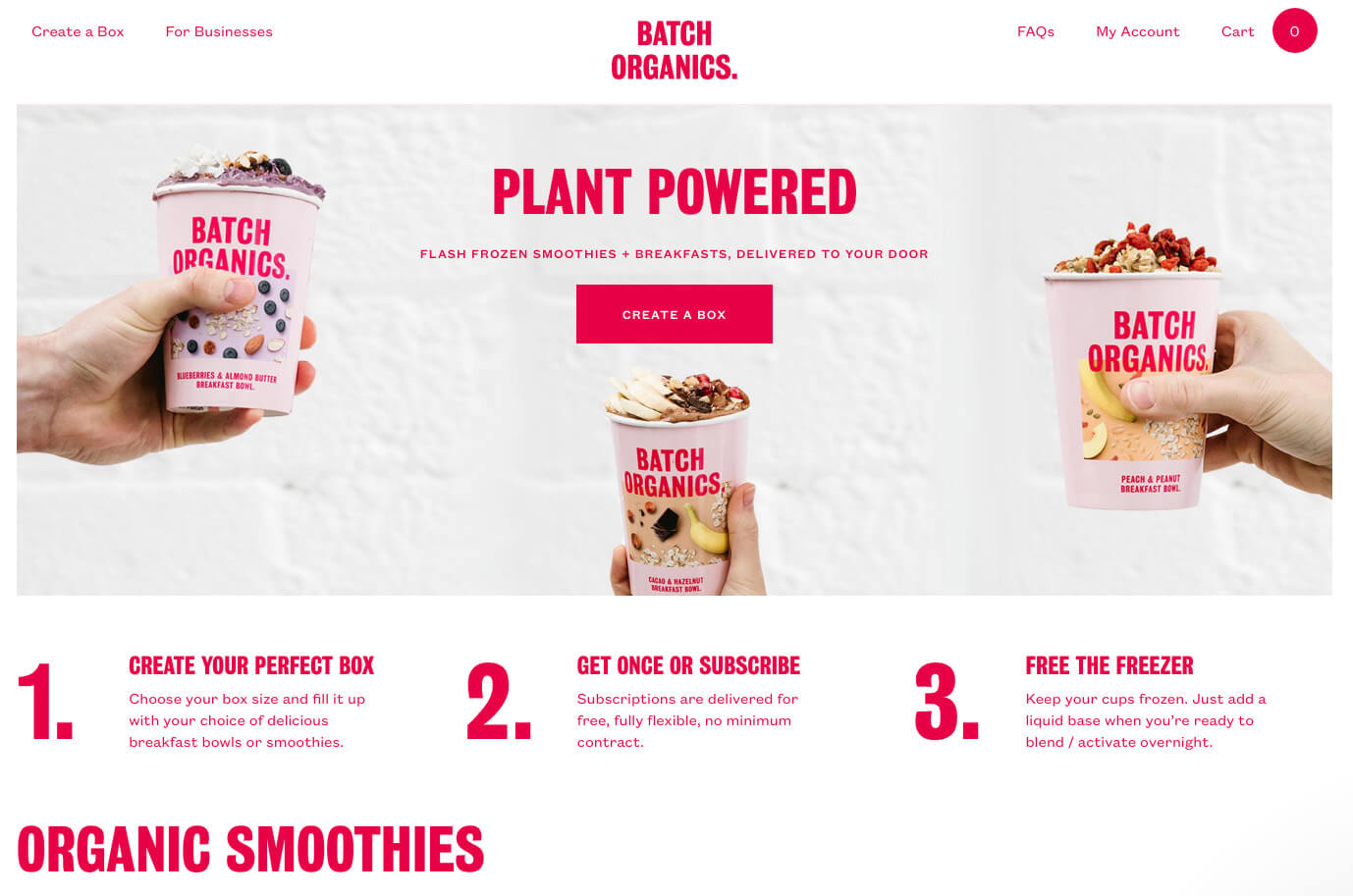
When we say Brutalist Design, we mean design cues from the early 90’s, unpolished aesthetics and big, bold, unmissable elements. We’re seeing more and more of this as the days go on, with sites like Bloomberg using a more minimal, polished style and others such as 20 Inventions & Studio Guillaumeruiz taking it the extreme with big block of web-safe colours and what would typically be perceived as ‘ugly’ design. This has caused a bit of rift in the design world, with some loving the return of the style and others despising every aspect of it, seeing it as a step backward especially in terms of web design. We love some of the elements used in ‘Brutal’ design and are just waiting for an excuse to use them in our design work, so watch out for our take on an old/new design style that we’re sure is here to stay!
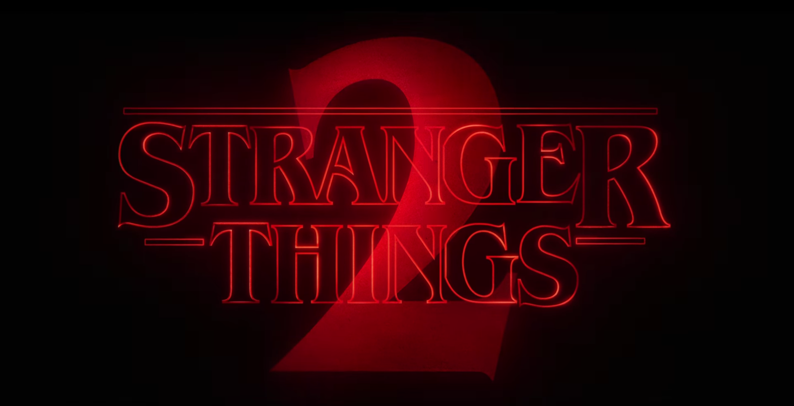
2017 saw the return of the much loved and highly anticipated Stranger Things for its second season (some of us binge watched it in one weekend). This, as always brought with it a flurry of fan artwork and the return of more 80s design nostalgia in the form of bright neon shapes, lens flares and cringe-worthy portrait compositions. Netflix grabbed this opportunity by the VHS and produced a range of retro posters for the release and promo of season two.
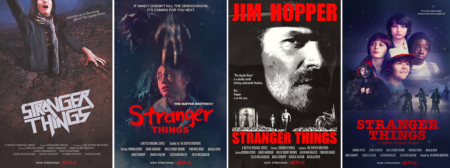
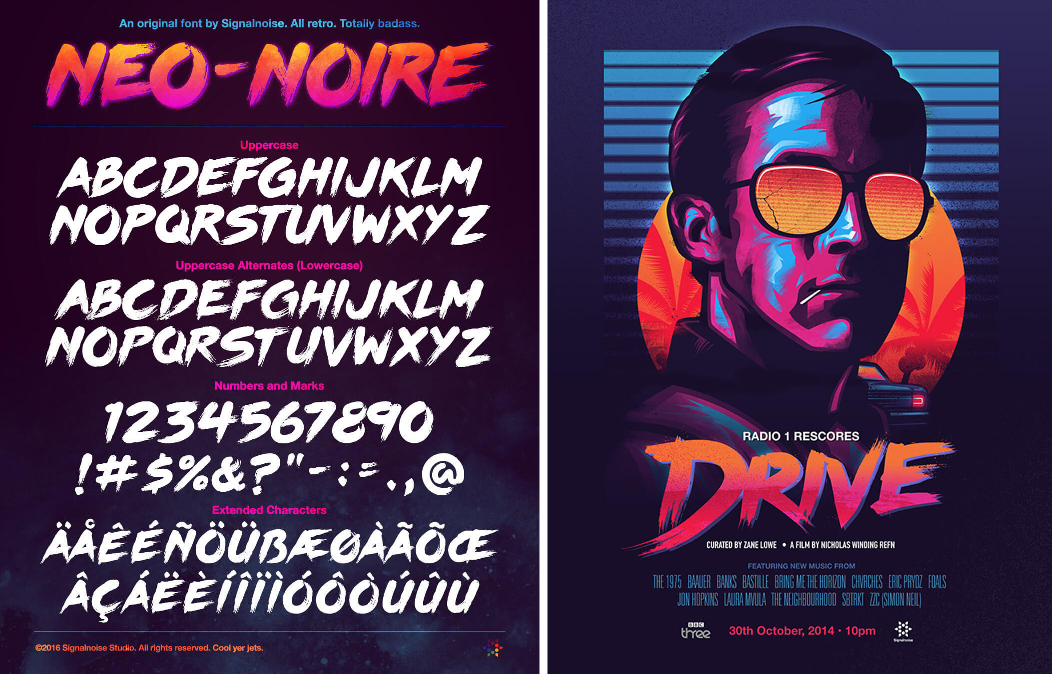
We expect to see plenty more 80’s themed design this year with references to some of our favourite childhood films and shows along with more fantastic fan art for shows that are themselves looking to the past for their inspiration and storylines. But if you can’t wait and need more bright, 80’s inspired design in your life, then head over to the online portfolio of James White aka Signalnoise. An artist who thrives on the use of bright gradient filled shapes and Tron like artwork.
2018 should be another interesting year for everyone involved in the Design Industry, expect to see moving typography literally popping out of your device screens, brutally large hamburger menus, buttons and type on your favourite websites, plenty of ‘Ultra Violet’ purple and of course the odd controversial rebrand. Whatever the year holds we can’t wait to get stuck in and start creating new, on-trend work for clients across the country.