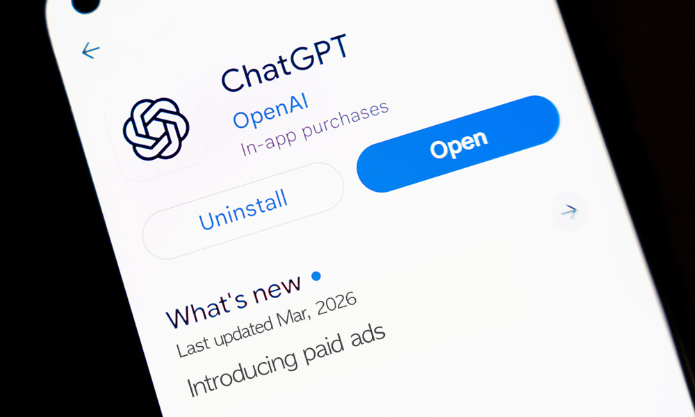
ChatGPT ads are on their way: What it means for...
- News
- Paid Media

Trends come and go, but good design? That sticks around. If you work in web design, you’ll know it’s not just about making a website look nice anymore – it’s about creating an experience that’s quick, easy, and, ideally, a little bit exciting.
I recently came across a list of design trends doing the rounds for 2025. Some felt familiar (and honestly, overdue), but a few stood out. Not because they’re flashy, but because they actually make life easier for the user.
Better experiences lead to better results, whether that’s a sale, a lead, a sign-up, or something else. Win-win.
So, here are a few trends I’ve spotted that are worth looking at in 2025, plus one extra that, in my opinion, shouldn’t even be called a trend anymore, it should just be the default.
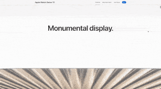
P.S. Before we start, I felt it best to mention the new Apple update: Liquid Glass.
It’s a bold UI shift, where the features are translucent, fluid, and reactive to the content around it. It’s sleek and it’s ambitious, and let’s be honest, it’s probably going to be everywhere soon. So while this is a VERY new trend, I’m expecting a wave of lookalikes in the next few years.
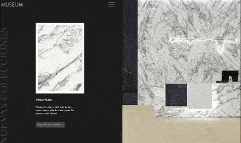
Let’s be honest, we’ve all landed on those long, static pages that feel like reading a textbook. All the info but nothing to keep us there.
Scrollytelling flips that on its head – providing a more immersive experience through multimedia elements that activate as you scroll a page. It’s interactive, it’s smooth, and when done right it’s genuinely fun to explore. It’s not just about flashy designs anymore (though they help), it’s about guiding the user through an intuitive, authentic experience.
For ecommerce brands, for instance, especially those with more premium products, scrollytelling helps you educate and impress without the chance for that ‘reading a textbook’ feeling. The longer they scroll, the longer they stay, and the more likely they are to buy.
These are the tiny things that no one notices… until they’re missing. Micro-interactions are those subtle visual cues that make a site feel that bit more professional: the “add to cart animation”, a progress bar when putting in information, or that zoom effect when you hover over an image.
It’s easy to downplay them as unnecessary cosmetic touches, but they do a lot of the heavy lifting when it comes to user experience. They reassure, guide and add that polished feel.
Most importantly, they build trust. Smooth feedback means your site feels reliable, responsive and considered – qualities people want when entering filling out an enquiry form, giving you their email address and especially when they’re putting in their card details. It can often be difference between a bounce and a buy.

These days, fast load times alone don’t cut it. User want smoothness as well as speed. That’s where creative transitions are needed.
Every time a potential buyer clicks from page to page, there’s a moment where they could click off instead. Transitions bridge that gap – they soften the harsh edges interrupting a user’s experience, making it feel intentional.
Done right, creative transitions can also add energy and certainly personality. They make every scroll, swipe or click feel considered. Here’s a few of my favourites:
The key is subtlety.

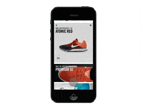
Most of the clients I’ve worked with see the majority of their traffic coming from mobile. So if your site isn’t optimised for mobile, you are already behind.
Mobile-first design doesn’t mean shrinking your desktop site to fit a smaller screen, it means designing your website to suit mobile from the start, then scaling it up to larger screens. Prioritising the experience people are actually having.
A few things I always look out for:
And of course: test, test, test. What looks clean on desktop might feel chaotic on mobile. Every scroll, tap, and swipe should feel seamless.
At this point, mobile-first isn’t about following a trend. It’s just good business.
Great web design is about finding a sweet spot where looks, UX and commercial goals all meet. A site that looks great but feels confusing won’t convert. One that’s functional but dull won’t stand out. And if they wow visitors yet fail to guide them toward checkout – or tie into your wider marketing – your ROI will see the losses.
If you’re ready to give your site a refresh, whether it’s a full redesign or a few smart tweaks, get in touch, our design team would love to see what they can do.